

Sea Salt: Calming Beachy Color Palette
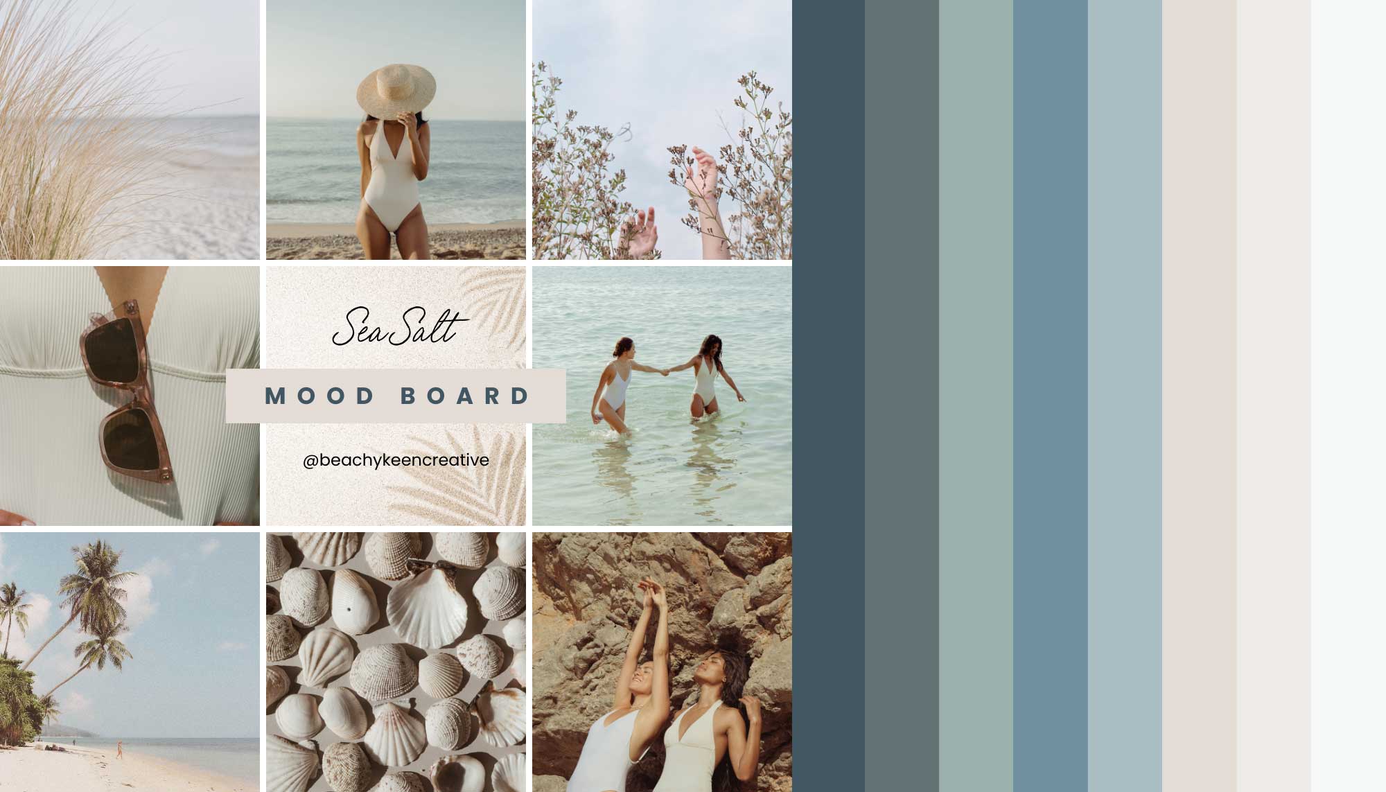
Immerse yourself in the tranquil tones of our Sea Salt calming beachy color palette. Inspired by the serene beauty of coastal landscapes, this collection captures the essence of sun-bleached shores, misty ocean mornings, and the subtle hues of beach treasures. From deep oceanic blues to soft sandy neutrals, Sea Salt offers a harmonious blend that brings a sense of calm and natural elegance to any space or design.
Sea Salt: The Calming Beachy Color Palette

Let’s walk through the palette from left to right:
Deep Ocean (#415662):
- Mood: Profound, grounding, authoritative
- Use: Perfect for call-to-action buttons, text, and headings. Use it to draw attention to important elements or to convey depth and expertise in your field.
Seafoam Sage (#627375):
- Mood: Balanced, natural, soothing
- Use: Excellent for icons, accents, and as a text color for subheadings. It’s gentle enough for longer reading without causing eye strain.
Mist Green (#9BB0AC):
- Mood: Fresh, growth-oriented, calming
- Use: Great for progress bars in courses, highlight boxes for key information, or as a background color for testimonial sections as it suggests personal growth and transformation.
Calm Blue (#7190A1)
- Mood: Tranquil, balanced, trustworthy
- Use: A great icon or accent color, it provides a calm, professional backdrop that enhances readability and user focus.
Sky Blue (#AABEC4):
- Mood: Open, inspiring, trustworthy
- Use: Ideal for header backgrounds or as an accent color. Bring images with this color into the design. It can create a sense of expansiveness and possibility in your digital space.
Hazy Horizon (#E4DCD5):
- Mood: Serene, contemplative, transitional
- Use: Excellent for creating gradient backgrounds, section dividers, or as a base color for infographics. It’s subtle enough to use in larger areas without overwhelming the design.
Sandy Beige (#EDEBE8):
- Mood: Warm, nurturing, grounded
- Use: Perfect for background colors in text-heavy areas, such as blog posts or about pages. It provides warmth and readability, making content feel approachable.
Sea Salt (#F6F9FA):
- Mood: Pure, clean, focused
- Use: Ideal as the main background color for your website or for content areas in course platforms. It provides a clean slate that allows other elements to stand out.
Sea Salt Calming Beachy Mood Board
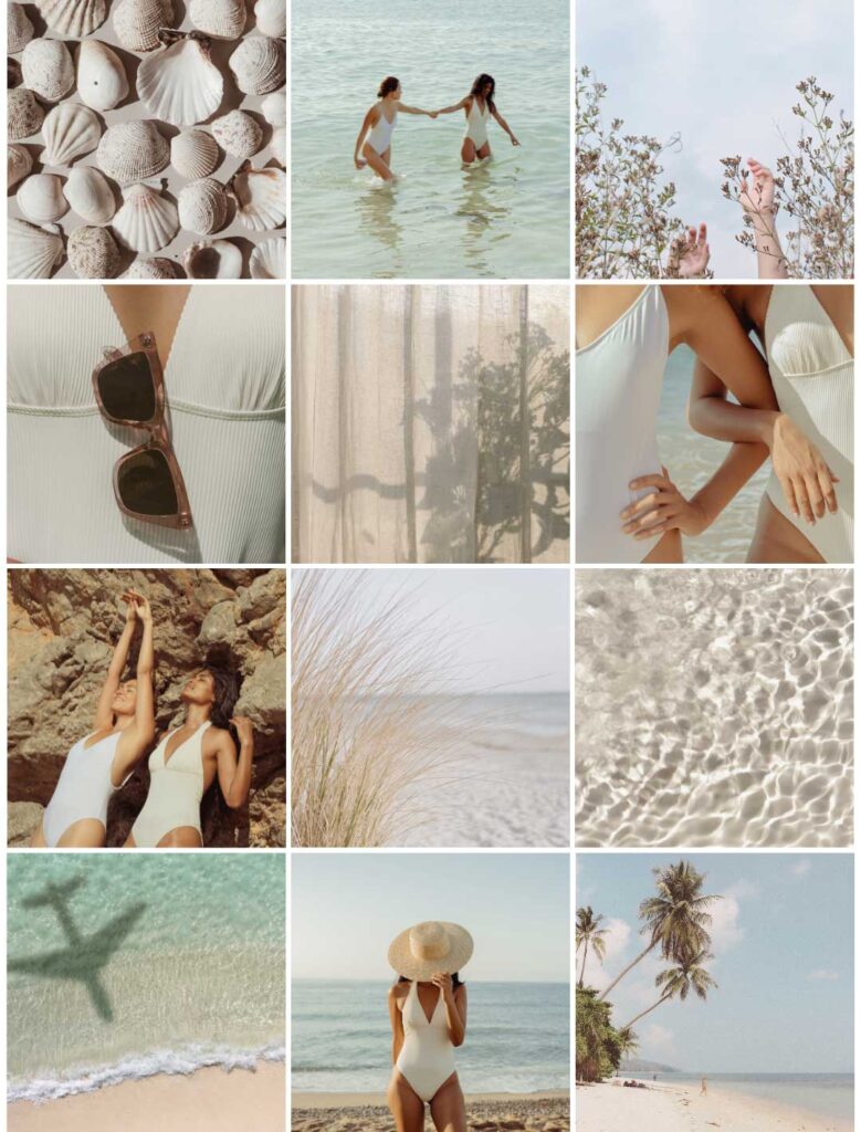
The Sea Salt palette mood board captures the essence of Coastal Minimalism, offering a visual journey through serene beachscapes and natural textures. This carefully curated collection provides a wealth of inspiration for brands looking to create a calming, authentic digital presence. By embracing this aesthetic, businesses can craft online spaces that feel like a refreshing escape for their audience.
Key takeaways for applying this aesthetic to your brand:
- Content Presentation: Use full-width image headers and minimalist design to create immersive, uncluttered user experiences.
- Color Palette: Adopt soft whites, warm beiges, and various shades of blue to create a harmonious visual identity.
- Texture Integration: Incorporate subtle grainy textures and smooth surfaces in backgrounds and graphic elements to add depth.
- Photography Style: Use high-key lighting with soft shadows and slightly desaturated tones for a cohesive, airy feel.
- Layout Design: Embrace negative space in web layouts, allowing content to “breathe” like the open skies and beaches.
- Natural Elements: Integrate organic shapes and nature-inspired graphics as visual metaphors or dividers in your design.

Leave a Reply


Your information is 100% secure and we promise not to spam you.
Crafting a professional, well-balanced color palette shouldn’t be gatekept. The Color Palette Guide reveals the secrets to creating a cohesive, visually stunning palette that speaks to your audience and reflects your brand’s personality.
Unlock the color secrets that top brand designers don't want you to know
Branding for all!


Take the FREE Signature Style Quiz, learn the core identity of your business, and make it a BRAND with tools and resources to put your style into action.
Turn your Business into a Brand with a your own Signature Style
FREE Brand Style QUIZ!!


