

How to Make Your Personal Brand Feel Like You
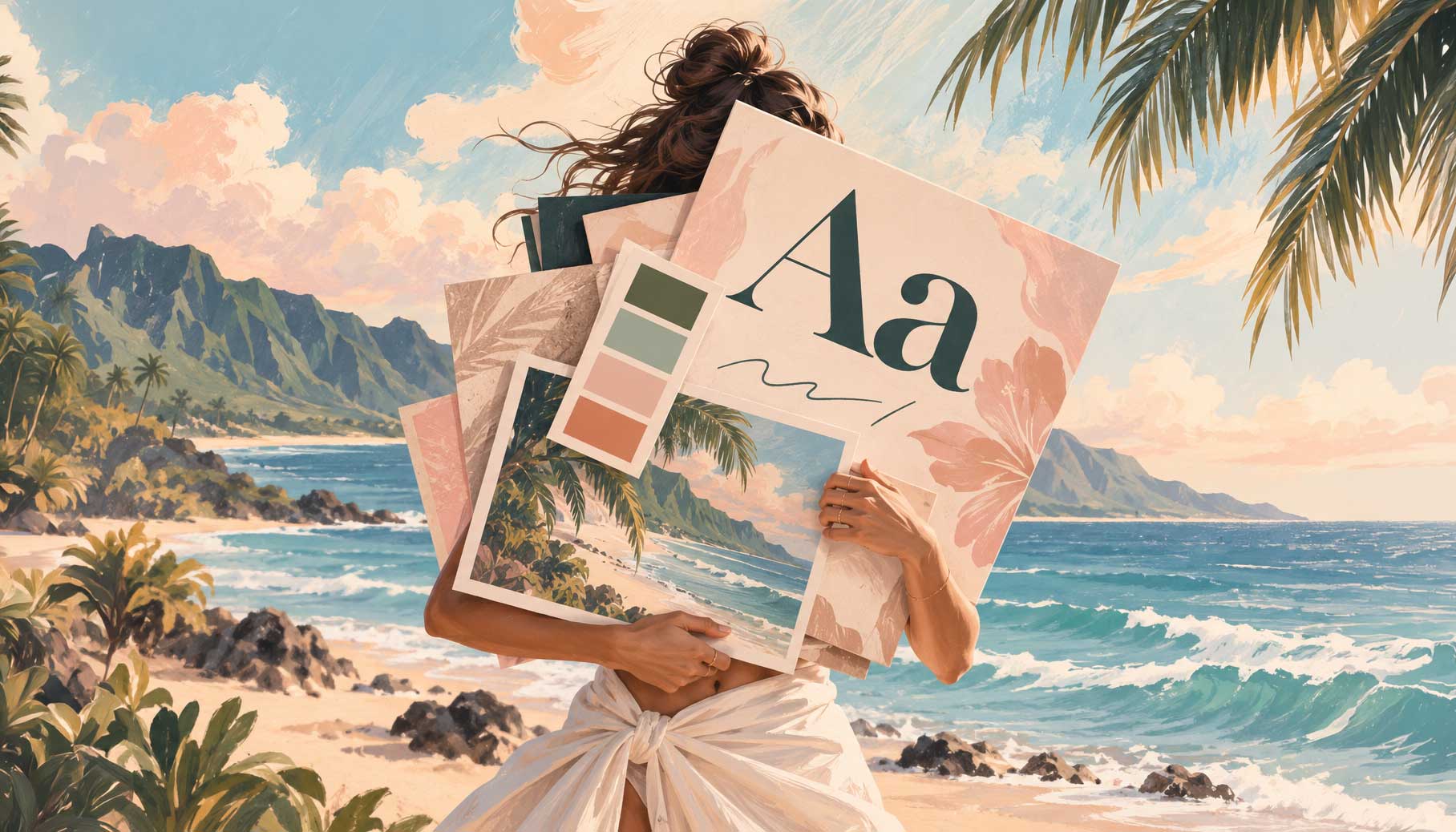
You know you want your personal brand to feel warm, bold, playful, or established.
Great!
But what does “warm” actually look like?
That’s the tricky part.
Because we throw around words like “modern,” “high-end,” “approachable,” and “playful” when we’re talking about personal branding all the time. But those words aren’t actually the design.
They’re the direction.
The design happens when you start translating those words into colors, fonts, imagery, shapes, copy, and all the other little choices that make a brand feel like something.
And sometimes, the difference between a brand that feels so you and one that just feels a little… off… is much smaller than you think.
Your personal brand is communicating more than you realize
Here’s a real-world example.
I recently designed a website for a restaurant that’s been around for almost 75 years.
The initial direction was pretty modern. Clean, tech-forward, make it ridiculously easy to order food online.
So… we did that.
And it was good!
But something was missing.
Because while this restaurant needed to function like a modern restaurant, it had also been around for almost 75 years!
Three generations.
There was history there!
And we’d accidentally designed a little too much of it out.
The problem wasn’t that the website looked bad.
It was that it didn’t quite feel like the business yet.
So instead of scrapping everything and starting over, we started turning some little dials.
The imagery was the biggest one. We brought in more of the restaurant’s history and started using food photography that felt a little more tactile and old-school instead of super clean and polished.
We darkened the color palette a bit.
We swapped some of the soft, curved edges for straighter ones.
We started using more all-caps typography.
Little things.
But together, they started pulling the website away from “modern restaurant that could have opened last Tuesday” and toward “this place has been here forever… but I can still order my sandwich online in approximately 12 seconds.” 😂
And THAT’S the sweet spot.
Because the goal wasn’t actually to make the website look old.
It was to make it feel established without feeling outdated.
Brand adjectives are a starting point, not a design
This same idea applies to personal branding.
Maybe you know you want your personal brand to feel:
- Warm but professional
- Fun but not childish
- High-end without feeling stuffy
- Bold but still approachable
- Creative without feeling chaotic
Those descriptions are incredibly helpful.
But they aren’t enough on their own.
If you say you want your brand to feel “warm and approachable,” there’s no Warm & Approachable button in Canva that magically spits out your brand. (Although at the rate AI is going, give it six months. 😜)
You have to decide what warm and approachable means for your personal brand.
Maybe it’s photography that feels candid and lived-in instead of perfectly posed.
Maybe it’s a warmer color palette.
Maybe it’s a softer font paired with casual, conversational copy.
Someone else could want a warm and approachable brand and make completely different choices.
That’s why I don’t love treating branding like a formula.
It’s not:
Warm = cream.
Luxury = serif font.
Fun = squiggly line. (Though I love a squiggly line 😜)
Your brand is the combination of all those little choices – and what they communicate together.
Think of each design choice as a little dial
This is one of the easiest ways I’ve found to think about visual branding.
Every choice turns the dial a little bit.
A chunky, all-caps font might turn the dial toward bold.
A delicate serif might move it toward elegant.
Bright, saturated colors can add energy.
Muted colors might make things feel softer or more grounded.
Highly polished editorial photography communicates something different than a slightly imperfect photo of you sitting cross-legged on your office floor.
Rounded shapes can feel softer. Straight edges can add structure.
Even (maybe especially) your copy is turning a dial.
“Let’s do this!” feels different than “Schedule your private consultation.”
Neither is better.
The question is where you’re trying to go.
And when enough of those little dials are turned in the same direction, people start to feel your brand before they’ve consciously analyzed any of it.
Why your personal brand might feel “off”
This is where DIY branding can get a little tricky.
It’s really easy to choose every piece individually.
You find a font you love. Then a color palette you saved on Pinterest. Then a website you think is gorgeous. Then a brand photoshoot inspired by somebody else’s Instagram.
Each thing might be beautiful on its own.
But when you put them all together?
Something doesn’t quite click.
Sometimes it’s because the individual pieces are telling slightly different stories.
Your colors are saying playful. Your typography is saying formal.Your photography is saying luxury. Your copy is saying “HEY GIRL HEYYYY!” 😂
None of those things is necessarily the problem.
It’s the combination.
This is why having a clear idea of how you want your personal brand to feel makes all of the visual decisions that come afterward so much easier.
Instead of asking only, Do I like this?
You can ask:
Does this move my brand in the direction I want it to go?
You probably don’t need to change everything
And this might be my favorite part.
If your personal brand doesn’t quite feel like you right now, please don’t immediately assume you need to burn the whole thing to the ground.
Sometimes you just need to tweak a thing or two.
Start with three-ish words you want someone to use to describe your personal brand.
Then pull up your website.
Look at your imagery. Your colors. Your fonts. Your shapes. Your copy. Your overall layout.
Ask yourself what each one is contributing to the feeling of your brand.
Where are they already moving in the right direction?
Where is something pulling you slightly off course?
Maybe your brand already feels warm and personal, but your stock photography feels a little too polished.
Maybe everything feels sophisticated and established except for one super-trendy font.
Maybe your visuals feel exactly like you, but the copy sounds like you swallowed a marketing textbook.
You don’t necessarily need to rebuild.
You might just need some subtle adjustments.
P.S. If you’re DIYing your personal brand and want some help figuring out how all those pieces work together, that’s exactly what I teach inside DIY Your Dream Brand.
Your personal brand should feel like you
Especially when you’re building a personal brand, there isn’t one objectively correct way your branding should look.
You’re part of the equation.
Your personality, your work, the people you want to connect with, and the experience you want them to have with you all matter.
So start with the feeling.
Choose a few words that describe it.
And then look at every little brand decision as a dial you can turn toward – or away from – those words.
Because your colors aren’t your brand.
Your fonts aren’t your brand.
Your photos aren’t your brand.
They’re all tools you’re using to communicate something bigger.
And when they start working together?
That’s when your personal brand stops just looking pretty and starts actually feeling like you.
Your brand deserves a style that feels like you— magnetic, and unforgettable. Take our quick Brand Style Quiz to discover the perfect aesthetic for your business.
Your brand Identity Starts with Style. Discover yours!

Leave a Reply Cancel reply
Privacy Policy
Terms and Conditions
Offering simple branding tools and customizable website templates for purpose-driven entrepreneurs ready to craft a memorable digital presence—with ease.


Digital Downloads
©2025 Beachy Keen Creative. All rights reserved.
Blog

Your information is 100% secure and we promise not to spam you.
Crafting a professional, well-balanced color palette shouldn’t be gatekept. The Color Palette Guide reveals the secrets to creating a cohesive, visually stunning palette that speaks to your audience and reflects your brand’s personality.
Unlock the color secrets that top brand designers don't want you to know
Branding for all!


Take the FREE Signature Style Quiz, learn the core identity of your business, and make it a BRAND with tools and resources to put your style into action.
Turn your Business into a Brand with a your own Signature Style
FREE Brand Style QUIZ!!


